The portfolio vs. landing page problem
Most product designers and UI/UX consultants build their primary web presence around a portfolio: case studies, screenshots, process walkthroughs. This makes sense as a showcase of craft - but portfolios are built to impress, and impressive is not the same as converting.
A founder or product lead who lands on a designer's portfolio is looking for one thing before they evaluate the work: evidence that this person understands the kind of problem I have and has solved it before. The portfolio answers "can they design?" The landing page answers "can they solve my specific problem?"
The distinction matters because B2B buyers - the founders, CPOs, and heads of product who hire product designers - make decisions based on fit and understanding first, craft second. They hire the designer who demonstrates they get the complexity of early-stage product thinking, not necessarily the one with the most polished Dribbble shots.
Real example: Nicey
The page below is Nicey's landing page - a product designer and design systems consultant specialising in B2B SaaS and AI platforms. View it live at lander.rs/nicey.
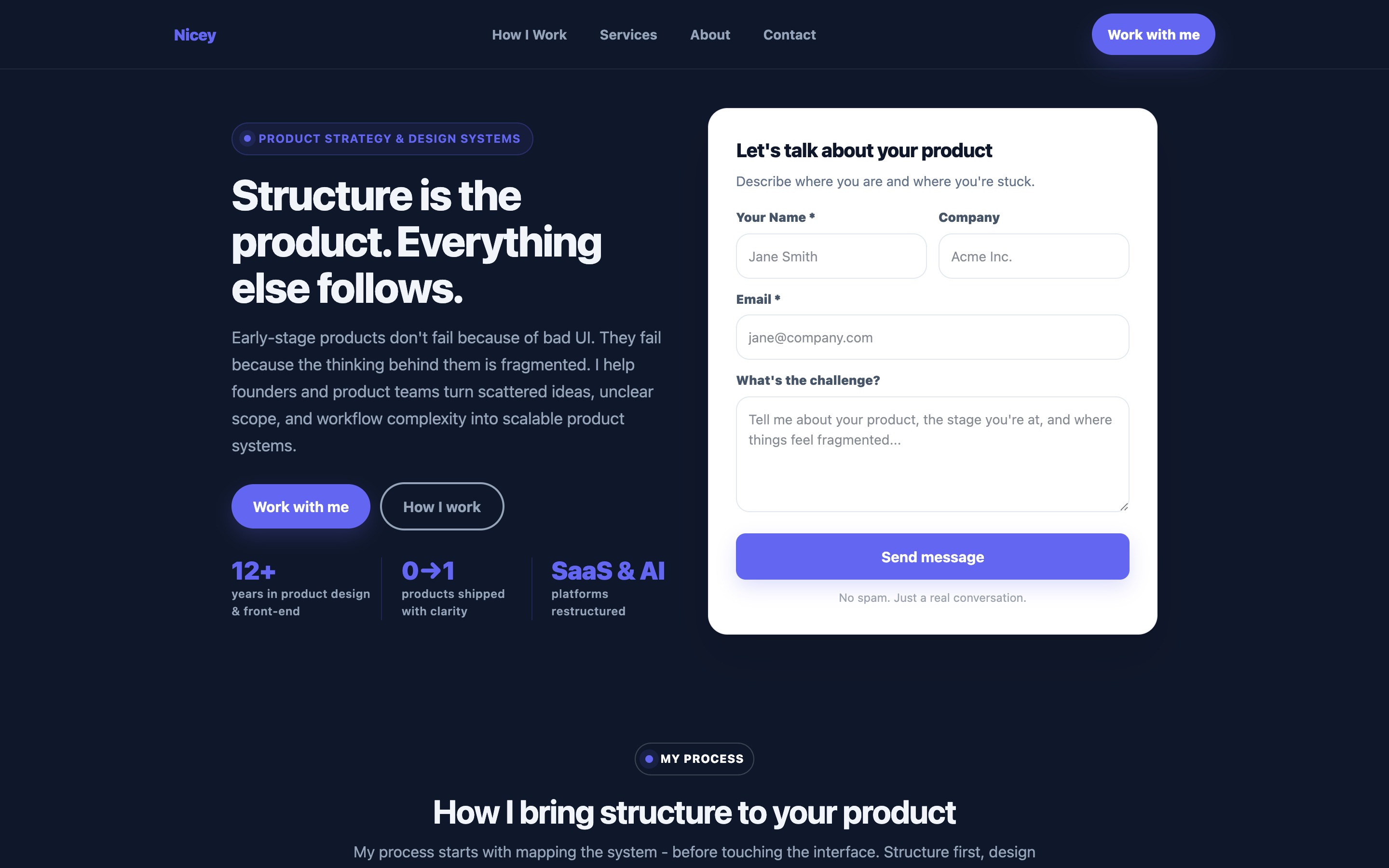
The headline - "Structure is the product. Everything else follows." - is a statement of philosophy, not a service description. It signals immediately that this is not a pixel-pushing designer but someone with a point of view on how good products are built. The type of founder who reads that and thinks "yes, that's what we're missing" is already predisposed to engage.
Mobile - the positioning badge, headline, and "Let's talk about your product" form are immediately visible
Strategic positioning over skill listing
The badge above Nicey's headline reads "Product Strategy & Design Systems" - not "UI/UX Designer" or "Figma Expert." This distinction is load-bearing. Product strategy and design systems are deliverables that founders value and understand in business terms. UI/UX is a skill category that could mean anything from wireframes to user research to visual polish.
By leading with the strategic deliverable rather than the craft skill, Nicey positions itself in a different tier of the market. It's not competing with the hundreds of UI designers on Upwork - it's competing with fractional CPOs and product consultancies. That positioning shift happens entirely in the badge and headline, before a single word of body copy is read.
The subheading reinforces this: "Early-stage products don't fail because of bad UI. They fail because the thinking behind them is fragmented. I help founders and product teams turn scattered ideas, unclear scope, and workflow complexity into scalable product systems." This is a diagnosis of a real problem that resonates with anyone who has shipped a product that felt incoherent despite good visual design.
The B2B headline formula
B2B service headlines follow different rules than B2C. A therapy headline needs warmth and emotional resonance. A physiotherapy headline needs urgency and outcome. A B2B product design headline needs to demonstrate understanding of a business problem - and ideally reveal a non-obvious insight about why that problem exists.
Nicey's headline does the latter: "Structure is the product. Everything else follows." This is a non-obvious claim - most people think of structure as an internal concern, not the product itself. But any founder who has shipped a product with good features that felt confusing to use recognises this insight immediately.
The B2B headline formula: [Non-obvious insight about the problem] + [Implication for the company].
- "Structure is the product. Everything else follows." (design systems / product thinking)
- "Your sales process is a product. Most companies treat it like a spreadsheet." (B2B sales consulting)
- "The problem isn't your idea. It's the three assumptions nobody tested." (product strategy)
- "Most onboarding fails in the first 90 seconds. Not the first 90 days." (UX / onboarding)
Each of these is a statement that a sophisticated B2B buyer reads and thinks: "they've seen this before." That recognition is the foundation of trust in a B2B context.
The open challenge form for B2B
Nicey's hero form is structurally different from every other landing page in this blog series. Instead of a dropdown or a list of options, the "What's the challenge?" field is an open textarea with the placeholder: "Tell me about your product, the stage you're at, and where things feel fragmented."
This is the right design choice for a B2B service with complex, varied engagements. A product redesign, a design system build, a 0-to-1 product launch, and a workflow simplification project are all different engagements with different scopes. A dropdown can't capture that nuance - and forcing the prospect to select from "Option A / Option B / Other" for a complex B2B challenge signals that the service provider doesn't actually understand how complex those challenges are.
The open textarea does the opposite: it invites the full context, signals that complexity is welcome, and produces enquiries that are far better qualified because the prospect has articulated their situation before the first call. This improves close rates because the first conversation can go directly to solutions rather than spending 30 minutes establishing context.
Note: the open form works for B2B precisely because the buyer is sophisticated and motivated enough to write a paragraph. For B2C or high-volume consumer services, the friction of a free-text field reduces completion rates. Match the form type to the buyer's profile and intent.
Process transparency as a trust mechanism
Nicey's "How I bring structure to your product" section walks through the engagement process - system mapping before interface design, structure-first approach, the flow from scattered to scalable. This process transparency does something important for B2B buyers: it makes the engagement feel concrete and de-risks the decision to hire.
One of the primary barriers to hiring a freelance product designer is uncertainty about what the engagement actually looks like. Will they disappear for weeks and deliver something misaligned? Will I have to manage them closely? What does the collaboration look like day to day?
A process section that answers these questions - clearly, in plain language - reduces that uncertainty and makes the engagement feel predictable. Predictability is a B2B conversion driver: enterprise and startup buyers alike prefer known risks to unknown ones.
Founder testimonials for B2B credibility
The "What founders say" section on Nicey's page carries a specific type of social proof that converts B2B buyers better than generic client testimonials: founder-to-founder validation. When a founder reads a testimonial from another founder - someone who has faced the same resource constraints, shipping pressures, and product ambiguity - the credibility transfer is direct.
B2B testimonials should always include company context: what stage the company was at, what the specific challenge was, and what changed as a result of the engagement. "Helped us build our design system from scratch before our Series A" is more useful than "great work, very professional." The former tells a pre-Series A founder exactly what to expect. The latter tells them nothing.
The stat line - 12+ years in product design & front-end, 0→1 products shipped with clarity, SaaS & AI platforms restructured - uses a format that resonates specifically with the B2B SaaS audience. "0→1" is product management shorthand that signals fluency in that world. "SaaS & AI platforms" names the verticals directly. These are not generic stats - they are signals of belonging to the same professional community as the buyer.
B2B vs. B2C: the conversion differences
Product designer landing pages that serve B2B clients need to make several design choices that differ from B2C service pages:
- Longer form fields, not shorter - B2B buyers write paragraphs; reducing friction via a two-field form signals low engagement threshold and attracts low-quality leads
- No pricing on the page (usually) - B2B engagements are scoped per-project; publishing rates before scope is known creates false anchors and invites price-only comparisons
- Company field in the form - tells you the size and type of client before the first call
- No urgency pressure copy - "Book now before spots fill up" is a B2C tactic that reads as manipulative to sophisticated B2B buyers
- Positioning statement over CTA repetition - B2B buyers need to understand your POV before they'll contact you; a section like "I operate at the intersection of strategy and execution" earns trust that a second CTA button does not
Landing page vs. portfolio site for B2B leads
| Factor | Portfolio site | Focused landing page |
|---|---|---|
| First impression | Case study grid - buyer must evaluate work before knowing fit | Problem diagnosis - buyer recognises their situation immediately |
| Positioning clarity | Often unclear - "I design things for startups" | Explicit niche and philosophy from the first line |
| Contact friction | "Contact" page buried in navigation | Contextual form with challenge question in the hero |
| Social proof type | Visual work quality (good for craft) | Founder testimonials with company context (good for trust) |
| Process visibility | Absent or in case studies only | Dedicated section that de-risks the engagement |
| Lead quality | Mixed - some come for inspiration, not to hire | High - self-selected by headline specificity |
| Typical conversion rate | 0.5–1.5% | 3–8% |
The portfolio still has value - link to it from the landing page for buyers who want to go deeper on craft. But the landing page handles the first conversion step: getting the right founder to send a message.
How to build one with lander.rs
Nicey's page was built in the lander.rs visual editor. The structure for a product designer / UI/UX consultant landing page:
- ContentSection (hero) - philosophy headline, problem diagnosis subheading, "Product Strategy & Design Systems" badge, name/company/email/open challenge form, B2B-specific stats
- Services (how I work) - 4-6 cards describing the process steps: system mapping, structure-first design, scalable component logic, handoff and documentation
- ImageWithText (positioning) - "I operate at the intersection of strategy and execution" - explains the consultant's unique position vs. a pure designer or a pure strategist
- Testimonials - 3 founder quotes with company stage and specific outcome
- CTASection - "Stop building on fragmented thinking" with secondary CTA
- FAQ - engagement structure, timeline, tools used, remote or on-site, retainer vs. project, how to know if ready
- ContactForm - full form: name, company, email, what's the challenge (textarea), link to product or figma (optional)
Build your product design landing page
All the components above are available in lander.rs - designed to convert B2B buyers, no code required. Your next project inquiry could come from a page you build today.
Try lander.rs freeNo credit card required. Cancel any time.