Why a landing page - not a website
A typical law firm website does many things at once: it lists practice areas, introduces attorneys, publishes blog posts, explains the firm's history, and maybe has a contact page buried three clicks deep. That is fine for Google searches where someone is researching their options.
But personal injury cases don't start that way. They start with pain, urgency, and a phone in someone's hand within hours of an accident. That person is not browsing - they are deciding.
A landing page is built for exactly this moment. It has one job: take someone who just had something terrible happen to them and make it completely obvious that your firm is the right call, right now. No navigation to distract them. No "About Us" to lose them. Just the essential information and a single clear action.
Studies consistently show that focused landing pages convert 3-5x better than general websites for paid traffic. In personal injury law, where a single case can be worth thousands in fees, that difference is enormous.
The "no navigation" principle is especially important here. Every link you add to a page is an exit. Research by marketing firm HubSpot found that removing navigation from landing pages increased conversions by up to 100%. When someone can only scroll down or fill in a form, a much higher percentage fill in the form.
A real example: Sullivan & Associates
Below is a live page built on lander.rs for a personal injury law firm. You can visit it at lander.rs/personal-injury.
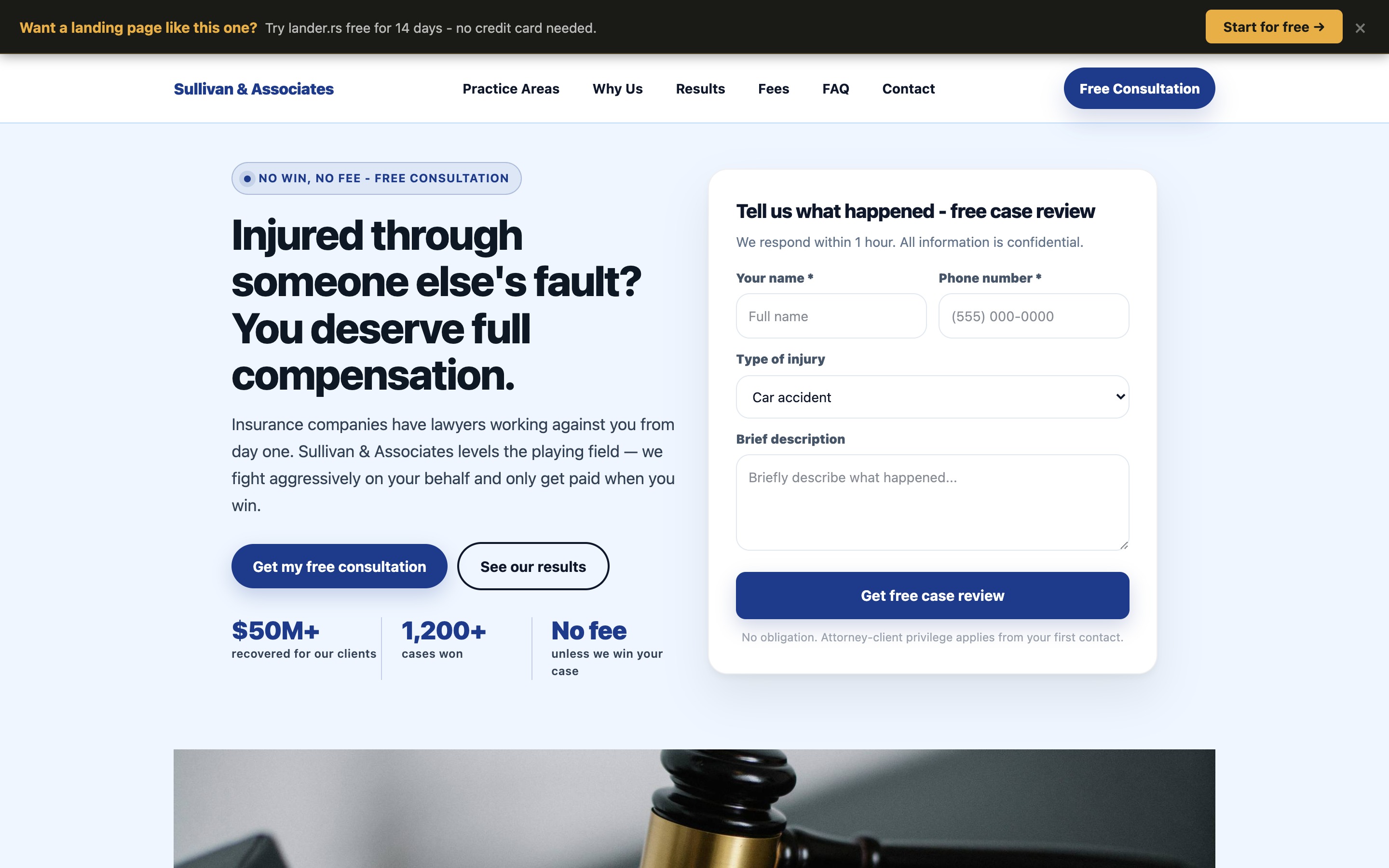
Desktop view (1440px wide) — above the fold
Notice what's happening in the first screen a visitor sees:
- The headline immediately addresses the visitor's situation ("Injured through someone else's fault?") - not the firm's achievements
- Social proof is front-loaded with concrete numbers ($50M+ recovered, 1,200+ cases won) rather than vague claims
- The consultation form is visible above the fold on desktop - no scrolling required to start the intake process
- The trust signal ("No fee unless we win your case") directly removes the #1 objection injury victims have
- Two CTAs with different intents serve both ready-to-act visitors ("Get my free consultation") and research-phase visitors ("See our results")
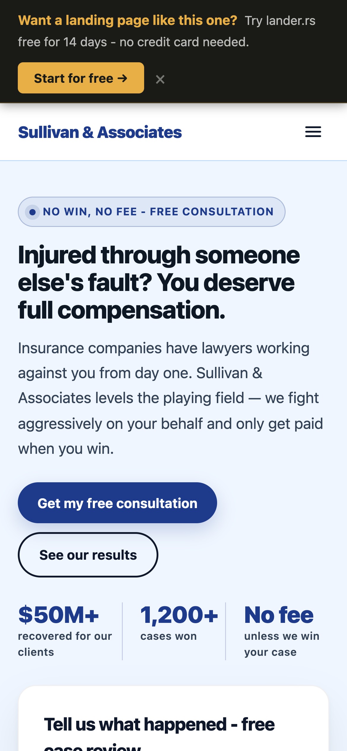
Mobile-first design
Over 70% of personal injury searches happen on mobile. The headline, trust badge, and CTA are all visible within the first scroll on a 390px screen.
Fast loading
lander.rs pages are served via a CDN-backed stack. A faster page means less drop-off before the visitor even reads your headline.
Mobile view (iPhone 14 Pro, 390px) — above the fold
What makes a personal injury page convert
1. Address the visitor, not yourself
The most common mistake in legal marketing is writing copy that glorifies the firm. "We have 20 years of experience... we have won hundreds of cases... our team is..." Stop. The injured person does not care about you yet. They care about their situation. Lead with their problem, not your credentials.
Compare these two headlines:
Weak
"Henderson Law Firm - Experienced Personal Injury Attorneys Serving the Greater Metro Area Since 2001"
Strong
"Injured through someone else's fault? You deserve full compensation."
The strong version speaks directly to the visitor's reality. It validates their situation ("you deserve") and implies outcome ("full compensation"). Read times are 3 seconds or less on the first screen - make every word earn its place.
2. Remove every objection above the fold
Injured people thinking about calling a lawyer almost always have the same hesitations: Can I afford this? What if I lose? Is this worth the hassle?
The page above handles all three in the hero section:
- "No fee unless we win your case" removes cost anxiety
- "$50M+ recovered" signals competence
- "We respond within 1 hour" removes friction (no long waiting)
Objection removal is not a section at the bottom of the page. It belongs at the top, where the visitor is deciding whether to keep reading.
3. Make the form easy to start
Long intake forms kill conversion. The form on this page asks only for name, phone, type of injury, and a brief description. The goal is not to collect full case information - it is to get a phone number so a human can follow up. Every additional form field costs you approximately 10% of submissions.
The form title also matters: "Tell us what happened - free case review" is far less intimidating than "Contact Us" or "Submit Your Information."
4. Stack social proof throughout the page
Personal injury clients are trusting you with one of the most stressful events of their lives. Social proof at multiple points on the page - real client testimonials with specific dollar amounts recovered, a breakdown of practice areas, a transparent fee structure - builds the trust that converts a hesitant visitor into a call.
Vague testimonials ("Great attorney, very professional") do almost nothing. Specific ones ("The other insurer offered $8,500. Sullivan & Associates recovered $94,000.") convert.
5. Urgency is real - use it
Personal injury cases have statutes of limitations. Evidence disappears. The page includes a CTA section that explicitly states: "The clock is running. Most injury claims must be filed within 2 years." This is not manufactured urgency - it is a real legal fact, and stating it plainly helps people who are procrastinating take action before it is too late.
Why legibility matters more than aesthetics
When a legal marketing designer says a page "looks professional," they often mean it has tasteful colors and an elegant layout. That is not the same as legible.
Legibility is the degree to which text can be read with minimal cognitive effort. It is the most underappreciated conversion factor in landing page design.
Font size
The industry standard minimum for body copy is 16px. Most law firm websites use 13-14px. On a mobile device held at arm's length by someone who just had an accident and may be in pain or distress, small text creates friction and abandonment. The Sullivan & Associates page uses 16px+ body text throughout, with the hero headline at 48px on desktop.
Line length and spacing
Lines that are too long (more than ~75 characters) force the eye to work harder to track across and return to the next line. The article column on this page - and the landing page body copy - stays within the 600-700px optimal reading width. Line height of 1.7-1.8 gives text room to breathe.
Color contrast
WCAG AA requires a contrast ratio of at least 4.5:1 for normal text. Many legal sites use light gray text on white backgrounds that fails this standard. Low contrast is particularly punishing for mobile users in bright sunlight - which is exactly where someone searching for an attorney after a car accident might be.
Visual hierarchy
A page with a clear visual hierarchy guides the eye naturally from headline to subheadline to body copy to CTA. When everything competes at the same visual weight, nothing stands out and the visitor doesn't know where to look. The personal injury page uses size, weight, and color contrast to create a clear reading path that ends at the form.
A page that looks beautiful but requires effort to read will always lose to a page that looks plain but is effortless to read. Clarity beats clever, every time.
Mobile is where personal injury cases are won
Google reports that over 70% of legal service searches happen on mobile devices. For personal injury specifically - where searches spike immediately after accidents - the number is even higher. People don't go home, open a laptop, and carefully research attorneys. They search on their phones within hours of the incident.
This means your landing page's mobile experience is not secondary. It is the primary experience. Here's what mobile-first means in practice:
- The headline must be readable without zooming - at least 28-32px on mobile
- The CTA button must be finger-tappable - at least 44px tall with clear visual contrast
- The form must work without a keyboard nightmare - proper input types (
telfor phone,emailfor email) trigger the right mobile keyboard - Images and sections must stack vertically - a two-column layout that looks good on desktop looks broken on a 390px screen unless explicitly designed to collapse
- Page speed is non-negotiable - a 1-second delay in mobile load time reduces conversions by approximately 20%
Every page built on lander.rs is responsive by default. The component system handles layout reflow automatically, and the hosting infrastructure ensures fast delivery on mobile connections.
lander.rs vs the alternatives
If you're a personal injury attorney looking to build a landing page, you have several options. Here's an honest comparison:
| lander.rs | Web agency | Generic builder (Wix, Squarespace) |
|
|---|---|---|---|
| Setup time | Minutes | Weeks to months | Days to weeks |
| Cost | From $15/month | $2,000-$10,000+ | $16-$40/month + extra for lead forms |
| AI page generation | Yes | No | Basic only |
| Lead form included | Yes, built-in | Custom build | Add-on / paid plan |
| Legal industry templates | Yes | Custom | Generic only |
| Custom domain | Yes | Yes | Paid plan only |
| You own the content | Yes | Depends on contract | Locked in platform |
Why agencies are overkill for a landing page
Web agencies are excellent for complex projects: custom CMS builds, e-commerce platforms, multi-location sites with custom integrations. A single-purpose lead generation page for a law firm is not that. Paying $5,000 for a landing page that takes 6 weeks to build and requires a developer for every edit is a poor allocation of marketing budget - especially when the page needs to be tested and iterated.
Why generic builders fall short
Wix and Squarespace are good products for general-purpose websites. But they are not optimized for lead capture at the component level. Their form builders are basic. Their templates are generic and require significant customization to look professional in a legal context. And their page speed performance, while acceptable, lags behind purpose-built landing page infrastructure.
Why lander.rs
lander.rs is built specifically for one thing: high-converting landing pages for service businesses. Every component - the hero section, the testimonials block, the pricing/fee structure, the contact form - is designed with conversion in mind. The platform is opinionated in the right ways: it is harder to build a bad page than a good one.
The AI generation feature means you can describe your firm and have a fully populated personal injury page in under a minute. You then edit, tweak the copy, and publish. The whole process - from blank to live - takes less time than a meeting with a web agency to discuss your brief.
And at $15/month versus $5,000+ one-time, the economics are straightforward. Even if you only get one additional case inquiry per month from a better landing page, the ROI is measured in hundreds of percent.
Build your personal injury landing page
The page you've seen in this article is available as a starting template. Here's how to get from zero to live:
Register free
Create your account at lander.rs - no credit card needed. You get a Free forever with full access to all features.
Generate with AI or start from template
Type a description like: "Personal injury attorney in Chicago, focusing on auto accidents and slip & fall. No win no fee. Aggressive negotiators." The AI generates a complete, populated page in about 60 seconds.
Edit your details
Swap in your firm name, real phone number, actual settlement amounts, and genuine client testimonials. The visual editor is drag-and-drop - no code.
Connect your domain and publish
Point your domain (e.g., free-consultation.yourlawfirm.com) at your page, hit publish, and you're live. Send traffic and start capturing leads.
See what your firm's page could look like
Free forever. No credit card. The personal injury template is available from day one.