The moment of search is the moment of crisis
When someone searches "divorce lawyer near me" at 11pm on a Tuesday, they are not comparison shopping. They are in the middle of one of the most stressful events of their life - a marriage breaking down, finances about to be upended, and in many cases, children caught in the middle. They need one thing before they can pick up the phone: confidence that you understand their situation and will handle it properly.
A general law firm website with a seven-item navigation, a stock photo of a handshake, and a "contact us" button does not give them that confidence. A focused landing page built around the specific fears, questions, and decisions of a divorce client does.
The firms that convert best are the ones that make a distressed visitor feel understood before they even scroll past the hero.
Real example: Harper Family Law
The example below is Harper Family Law's landing page, built on lander.rs. It demonstrates every principle covered in this article - and you can see it live at lander.rs/divorce-lawyer.

The page opens with a headline that directly names the emotional reality: "Divorce is Hard. Your Lawyer Shouldn't Make It Harder." That's not a tagline - it's a promise. It signals that this firm understands the experience isn't just legal, and that they won't add to the burden.
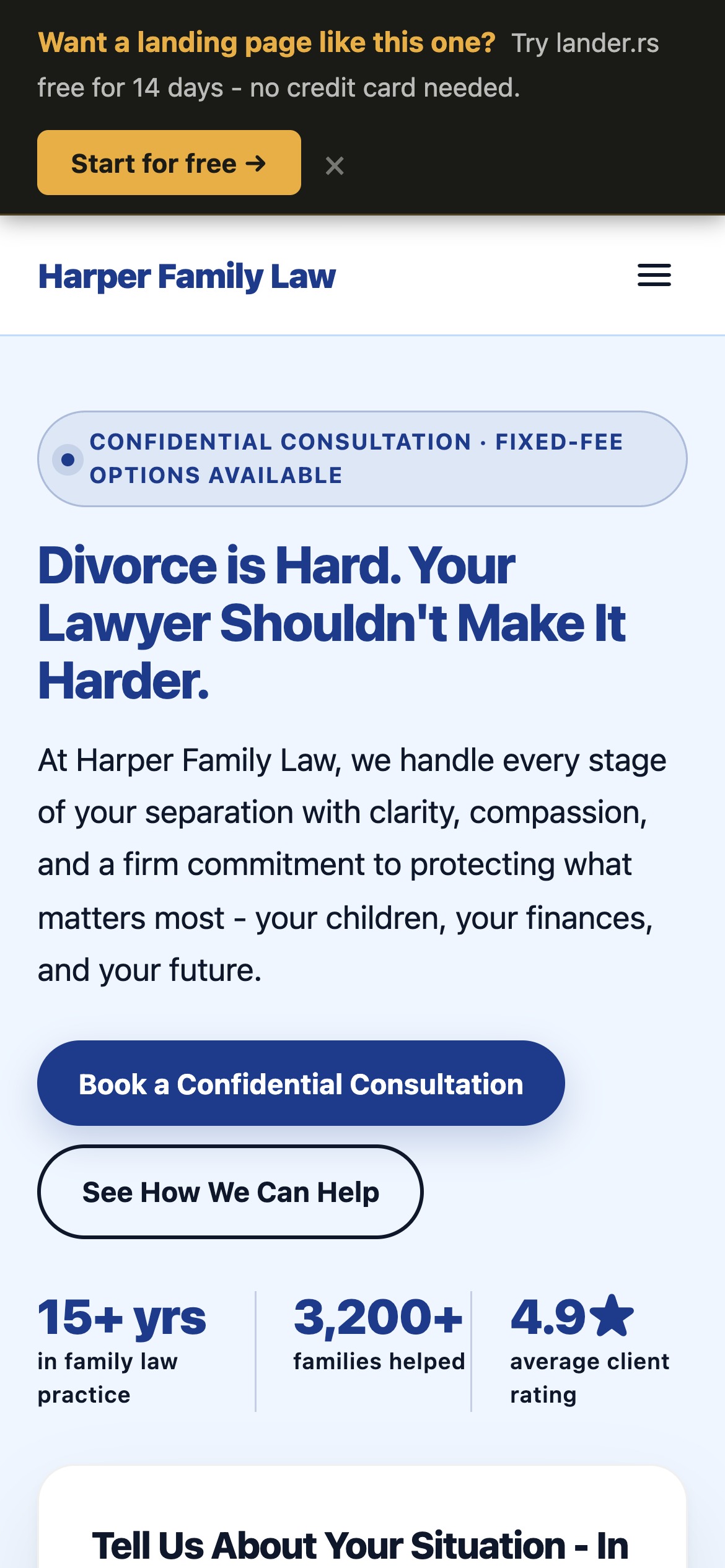
Mobile view - single-column layout keeps the CTA immediately visible on a 390px screen
Emotional headlines that don't exploit
Divorce law headlines have to do something that most legal niches don't require: they must be emotionally resonant without feeling manipulative. A personal injury headline can say "We fight for every dollar." A divorce headline needs something more nuanced - because the prospect isn't primarily thinking about money. They're thinking about their children, their home, and their dignity.
The best divorce landing page headlines follow a simple formula:
Acknowledge the emotional reality → Reframe it toward strength and clarity
- "Divorce is Hard. Your Lawyer Shouldn't Make It Harder."
- "Protecting Your Children, Your Assets, and Your Future."
- "Firm When It Matters. Compassionate Always."
Each of these validates what the visitor is feeling, then immediately pivots to what the firm provides. None of them mention winning or fighting - because for many divorce clients, winning is a complex concept when children are involved.
Trust signals for a sensitive niche
In most service niches, trust signals are about competence. In divorce law, they must communicate something deeper: that you will handle this situation with the seriousness and discretion it deserves.
Harper Family Law's page uses three types of trust signals:
Credibility stats above the fold
Three headline numbers - 15+ years in family law practice, 3,200+ families helped, 4.9-star average rating - are positioned next to the consultation form. These are not boasts; they are reassurance. A prospect who sees "3,200+ families helped" understands that this firm has handled cases like theirs before.
Confidentiality as a feature
The word "confidential" appears in the headline badge, the form title, the submit button text, and the form footer. This is intentional. Many people searching for a divorce lawyer are afraid their spouse, employer, or family might find out they're looking. Reinforcing confidentiality at every touchpoint removes a significant barrier to conversion.
Real client testimonials with specific outcomes
Generic testimonials ("great service, very professional") do very little in divorce law. Outcome-specific testimonials do a great deal:
"My ex had a very aggressive attorney who tried to claim assets that were clearly mine before the marriage. Harper Family Law was methodical and calm - they documented everything, countered every argument, and I walked away with a settlement that was genuinely fair."
This testimonial addresses a specific fear (the other spouse having a better lawyer), demonstrates a specific capability (asset protection), and resolves with a specific outcome (fair settlement). Every word is doing work.
Practice areas as reassurance, not a menu
Most law firm websites list practice areas as a navigation element - a menu that says "we do these things." A conversion-optimised landing page presents practice areas differently: as answers to the specific questions a divorce prospect is already asking in their head.
Harper Family Law's Services section covers six areas:
- Uncontested Divorce - for visitors who just want this to be over quickly and cleanly
- Contested Divorce - for visitors who know it won't be easy
- Child Custody - often the primary anxiety for parents
- Asset Division - addresses the financial fear directly
- Spousal Support - relevant for both parties in longer marriages
- Prenuptial Agreements - catches a different audience segment
Each description is written to the emotional state of someone in that situation - not as a legal definition, but as a signal that the firm understands what's actually at stake.
Pricing transparency wins cases in family law
The number one reason people delay hiring a divorce attorney is not uncertainty about whether they need one. It's fear of an open-ended bill. "Hourly billing" combined with a contested divorce can feel like a financial black hole - and many people would rather endure a bad situation than trigger costs they can't predict.
Addressing this directly on the landing page converts fence-sitters into booked consultations. Harper Family Law's pricing section does three things well:
Two clear tiers
A flat-fee package for uncontested divorces (predictable cost, appeals to the amicable split segment) and hourly billing for contested matters (honest about complexity, but with the reassurance of transparent monthly statements and payment plans). Most visitors will identify with one tier immediately.
A low-barrier entry point
The $150 consultation fee - credited toward case fees if you proceed - removes two objections at once. It's low enough that cost isn't a barrier to the first conversation, and the credit-on-retain structure means it feels like zero risk. This is the type of pricing detail that turns an interested visitor into a booked call.
A note that sets expectations
The pricing section note reads: "Every case begins with a $150 consultation. This fee is credited toward your legal fees if you retain Harper Family Law. No obligation to proceed." That last sentence - "no obligation to proceed" - is not legally significant, but psychologically it's crucial. It makes the first step feel safe.
Intake form design for a high-anxiety audience
The consultation request form is where a visitor either becomes a lead or leaves. In divorce law, form design matters more than in almost any other niche because the prospect is anxious, often on a mobile device, and potentially nervous about the information they're disclosing.
Harper Family Law's hero form uses three fields: name, phone, and email (optional). That's it. The minimal form in the hero is intentional - it reduces friction at the moment of highest intent. The longer contact form lower on the page (with situational dropdowns and a message field) serves visitors who arrived via organic search and want to self-qualify before calling.
Key form design principles for this niche:
- Keep the hero form to 2-3 fields - name and phone is all you need to start the conversation
- Mark email as optional - many people are wary of email trails; making it optional increases completion
- Use sensitive placeholder copy - "Tell us about your situation" is better than "Message"
- Repeat the confidentiality promise at the form submit button - "Request Confidential Consultation" converts better than "Submit" or "Send"
- Add a consent footnote - "All information is protected by strict attorney-client confidentiality" - directly under the submit button
Mobile-first for a mobile-heavy audience
Family law searches are disproportionately mobile. People are searching from parked cars, waiting rooms, and late at night in a room they're sharing with the person they need to leave. A page that requires pinching and zooming is not just an inconvenience - it's a conversion killer in a context where the visitor's emotional tolerance is already low.
lander.rs pages are built responsive by default. Every component - the hero with the consultation form, the practice areas grid, the testimonials, the pricing comparison - collapses to a single-column layout that reads cleanly at 390px. The CTA button stays full-width and thumb-reachable at every scroll depth.
Landing page vs. general law firm website
| Factor | General law firm website | Focused landing page |
|---|---|---|
| Navigation distractions | 7-10 menu items pulling attention away | No navigation - one goal, one action |
| Headline relevance | Generic ("Trusted Legal Representation") | Specific to divorce prospect's emotional state |
| Social proof | Generic firm accolades or bar memberships | Outcome-specific testimonials from divorce clients |
| Pricing information | Typically absent - "call for a quote" | Transparent tiers with a low-barrier entry consultation |
| Confidentiality signals | Privacy policy link in the footer | Repeated throughout - badge, form, button, footnote |
| Mobile experience | Often serviceable but not optimised for conversion | Single-column, full-width CTA, fast load |
| Typical conversion rate | 1-2% | 5-12% |
The conversion rate gap is not primarily a design difference. It's an intent-matching difference. A general website is built to inform anyone about a firm. A landing page is built to convert one specific type of visitor - someone actively looking to hire a divorce attorney - and everything on the page is optimised for that single goal.
How to build one with lander.rs
Harper Family Law's landing page was built entirely in the lander.rs visual editor - no code, no developer, no design agency. The build process for a divorce lawyer page follows a consistent structure:
- ContentSection (hero) - headline + 2-3 stats + consultation form with confidentiality copy
- ImageSection - a wide team or office photo with a brief trust statement as caption
- Services (practice areas) - 6 cards, each written to a specific client fear or situation
- ImageWithText (approach) - plain-language communication, child-focused, fixed-fee options
- Testimonials - 3 outcome-specific quotes with name initials and case type
- ImageWithText (process) - consultation, negotiation/mediation, litigation if necessary
- Pricing - flat fee vs. hourly, with the $150 consultation entry point
- CTASection - repeat the primary CTA with urgency copy ("The sooner you understand your options...")
- FAQ - 5 questions that address cost, timeline, custody, and court appearance fears
- ContactForm - longer form for organic traffic with situational dropdowns
Build your divorce law landing page
lander.rs gives you all the components above - pre-styled, mobile-optimised, and wired to send leads directly to your inbox. No code. No developer. Up in an afternoon.
Try lander.rs freeNo credit card required. Cancel any time.