The Gumroad checkout problem
Gumroad is one of the best tools for selling digital products - it handles payments, delivery, and customer management with almost no setup. What it doesn't do well is convert cold traffic into buyers. The Gumroad product page is built to close people who already know they want to buy, not to persuade people who are still on the fence.
When you run Meta ads, write SEO content, or post on social media, most of the people who click are curious - not committed. They've seen something interesting and want to know more. If the next page they land on is a Gumroad checkout with a price and a buy button, most of them will close the tab. They weren't ready to buy; they were ready to be convinced.
A dedicated landing page sits between your traffic source and your checkout. It does the convincing work: explaining the problem, demonstrating that your product solves it, building trust through social proof, and handling the objections that stop curious visitors from becoming buyers. By the time they click through to Gumroad, they've already decided.
Real example: The Bridge Hiring Protocol
The page below is The Bridge Hiring Protocol's landing page, built with lander.rs. View it live at thebridgehiringprotocol.com.
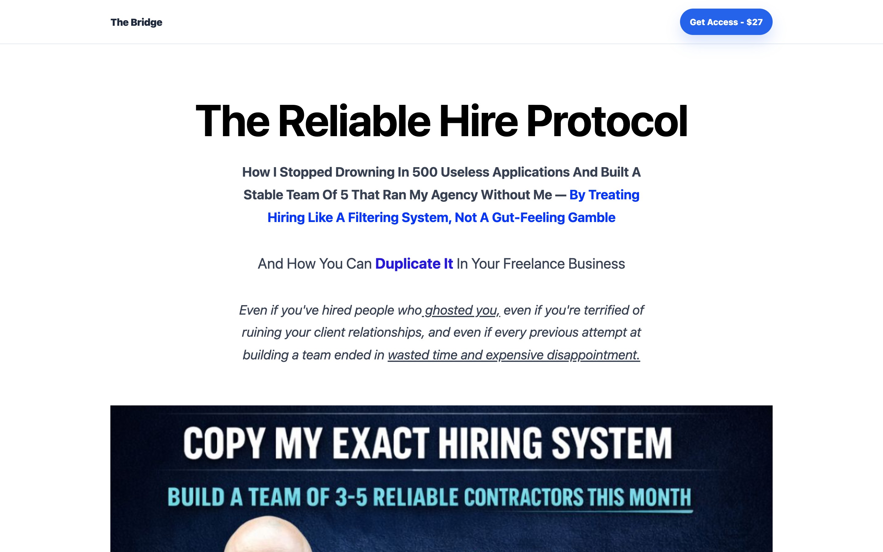
The Bridge Hiring Protocol is a digital product for hiring managers and team leads. Rather than sending ad traffic directly to a checkout page, they use a dedicated landing page that frames the problem, explains the solution, and builds the case for why this specific product is the right answer - before asking for money.
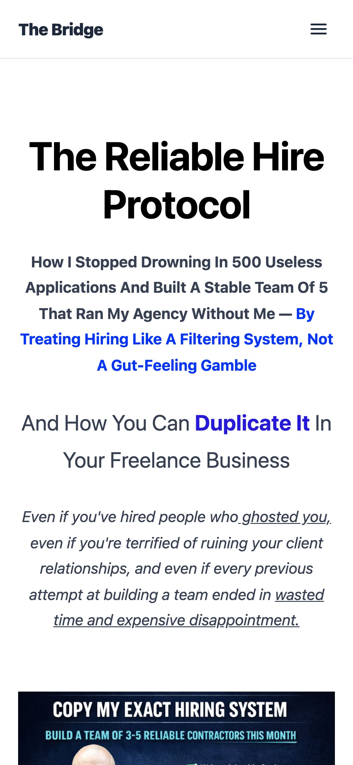
Mobile - the problem and solution are clear before the user scrolls
Warming up the buyer: what happens before the buy button
The gap between "I clicked an ad" and "I entered my credit card" is almost entirely psychological. The visitor is asking a series of silent questions in sequence: Is this for someone like me? Does this actually solve the problem I have? Why should I trust this person? Is this worth what they're charging? What if it doesn't work?
A Gumroad checkout page answers almost none of these questions. A landing page answers all of them - in the right order. It starts by naming the problem so specifically that the reader thinks "this is written for me." It explains what the product is and what it does. It shows results or testimonials from people who used it. It handles the price objection by framing value. It offers a guarantee if one exists.
By the time the visitor clicks "buy," they've been walked through every step of the decision process. That's what the conversion rate difference between 1% and 5% actually is: the difference between dropping people at the buy button and walking them to it.
Why paid traffic specifically demands a landing page
If you're running Meta or Google ads to a Gumroad product page, you're paying for clicks from people who have never heard of you. They have no existing relationship with your brand, no prior exposure to your work, no reason to trust you. They clicked because the ad interrupted them with something that looked interesting.
That's a very different visitor from someone who found you organically through content, follow you on social media, or was referred by a trusted source. Organic and referral visitors arrive with some degree of pre-existing trust. Paid traffic arrives cold.
Cold traffic needs more convincing. Dropping cold paid traffic on a checkout page is one of the most common and expensive mistakes in digital product marketing. The math is simple: if you're paying $1 per click and converting at 1%, you're spending $100 per sale. If a landing page lifts conversion to 3%, you're spending $33 per sale. The same ad budget produces three times the revenue - or you can cut the ad spend by two-thirds and maintain the same output.
"The landing page isn't an extra step - it's the step where the money is made or lost."
What a high-converting digital product page includes
The structure that works for digital products is consistent across categories - courses, templates, frameworks, protocols, ebooks. The details change; the architecture doesn't.
A headline that names the problem, not the product
Your product name is not your headline. "The Bridge Hiring Protocol" tells a visitor nothing about whether they need it. A headline that says "Hire the right person the first time - a structured process for managers who keep getting burned by gut-feel decisions" tells them exactly who this is for and what it solves. If they're a manager who has made costly hires, they read that and lean forward.
A clear statement of what they get
Digital products are intangible by nature. Reduce uncertainty by being specific about what the buyer receives: number of pages, modules, templates, frameworks, video hours, or implementation time. "A 47-page PDF with a 5-step interview framework and 30 ready-to-use questions" is more compelling than "a comprehensive hiring guide."
Social proof at the right moment
Testimonials work best placed just before the buy button, when the visitor is closest to deciding. The most effective testimonials for digital products are specific about the result: "I used the framework to hire two engineers in Q1 and both are still with us 18 months later" converts far better than "Really useful, highly recommend."
Objection handling built into the copy
The three objections that kill digital product sales are: "I'm not sure this is for me," "I'm not sure it works," and "I'm not sure it's worth the price." Address all three explicitly in the page copy. Don't wait for the buyer to think of them; answer them before they have to ask.
Test messaging angles in minutes with AI
One of the biggest advantages for digital product creators using lander.rs is the ability to rapidly test different positioning. You might not know whether your buyer responds more to a pain-led angle ("Tired of hires that don't work out?") or an aspiration-led angle ("Build the team that actually delivers"). With AI-generated pages, you can have both versions live in under five minutes and route split traffic to see which converts better.
This kind of rapid experimentation used to require a developer or a Webflow subscription and several days of work. The creators who find product-market fit fastest are the ones who can run the most tests with the least friction. Building a new angle, publishing it, running $50 of ads, and reading the results - that loop can now happen in an afternoon.
Over time, you accumulate clear signal: which headline framing, which testimonial placement, which CTA copy drives the most purchases from paid traffic. That signal is worth more than any single sale because it compounds across every campaign you run after.
Landing page vs. Gumroad checkout
| Factor | Gumroad checkout page | Dedicated landing page |
|---|---|---|
| Visitor context | Assumed to be ready to buy | Meets them where they are (curious, skeptical) |
| Problem framing | None - skips straight to product | Opens with the problem the buyer has |
| Trust signals | Basic (rating, number of sales) | Full testimonials, buyer results, social proof |
| Objection handling | None | Built into the copy and FAQ |
| Cold traffic conversion | 0.5-1.5% | 3-8% |
| Custom domain | gumroad.com/l/yourproduct | yourproduct.com - brand you own |
| SEO | None - Gumroad's domain, not yours | Your domain, your content, your traffic |
How to build one with lander.rs
The Bridge Hiring Protocol's page was generated with lander.rs in under a minute by describing the product and the target buyer. The structure for a digital product landing page:
- Hero section - problem-naming headline, subheading that introduces the product as the solution, CTA button linking to Gumroad checkout
- What you get - specific breakdown of what's included (pages, templates, frameworks, modules), eliminates uncertainty about the product
- Who it's for - 3-4 bullet points naming the exact profile of the ideal buyer; makes self-selection easy
- How it works - 3-step process: buy, implement, result. Reduces perceived effort and makes the outcome feel reachable
- Testimonials - result-specific quotes, placed close to the buy button
- FAQ - handles the 4-5 objections that stop buyers at the last step: format, refund policy, who it's for, how long it takes
- Final CTA - repeat the buy button with a short urgency or value reminder ("$49 - instant download")
Build your digital product landing page
Describe your product and who it's for. lander.rs AI generates a full landing page in under a minute - problem-led headline, social proof, FAQ, CTA. Connect your Gumroad checkout link and you're live.
Try lander.rs freeNo credit card required. Cancel any time.