The unique friction of therapy conversion
Selling therapy is unlike selling most services. The prospect already knows they need help - they wouldn't be searching if they didn't. The barrier is not awareness and it's rarely budget. It's something harder: the step of admitting to a stranger that you're struggling.
Most people who search for a therapist have been thinking about it for weeks or months. They've talked themselves out of it multiple times. They are on your page ready to act, but one friction point - a clinical tone, a complicated booking process, an impersonal photo - can tip them back into “I'll think about it.”
A therapy landing page must do something unusual in conversion design: it must feel human before it asks for action. The warmth of the page, the directness of the language, and the low-commitment nature of the first CTA are more important here than they are in almost any other service niche.
Real example: Dr. Sarah Mitchell
The page below is Dr. Sarah Mitchell's psychotherapy landing page, built on lander.rs. View it live at lander.rs/psychotherapist.
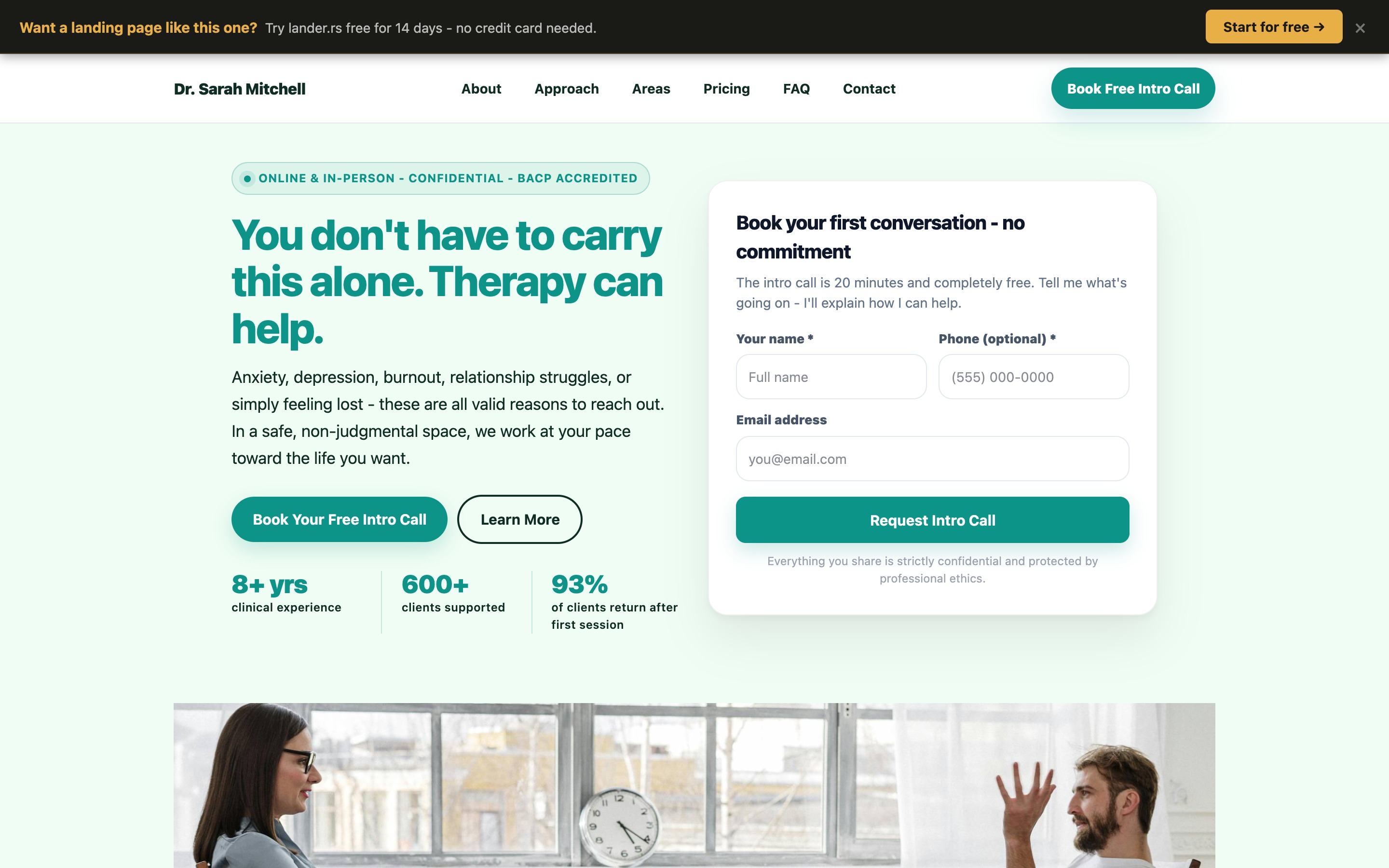
The headline - “You don't have to carry this alone. Therapy can help.” - is not a service description. It's an emotional acknowledgement. It meets the visitor where they are: burdened, possibly isolated, and uncertain whether help is even available to them. The second sentence (“Therapy can help”) is direct and hopeful without overpromising.
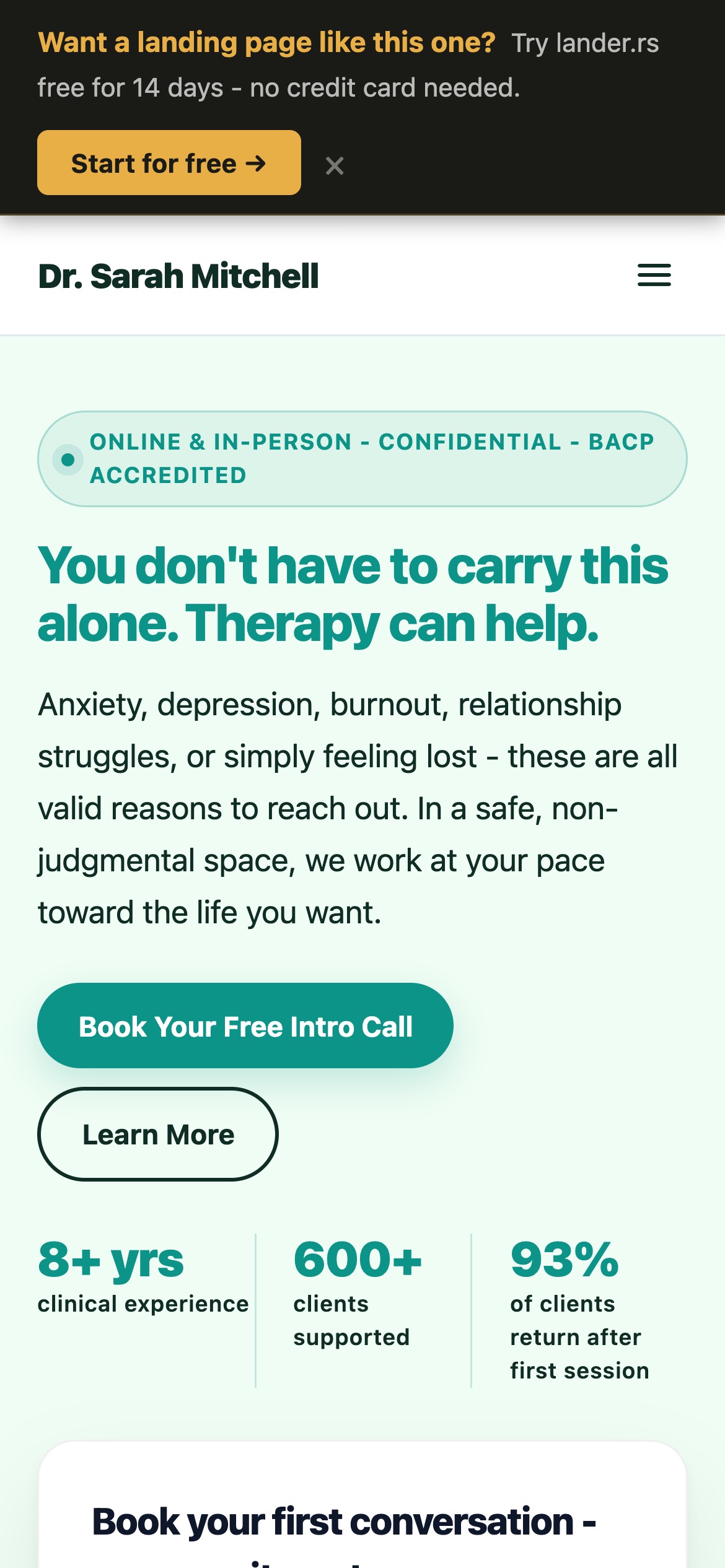
Mobile - the badge, headline, and “Book Free Intro Call” form are immediately visible at 390px
The free intro call mechanic
The most effective conversion mechanism for a therapy practice is not a booking form for a paid session. It is a free, no-commitment 20-minute introduction call - and this distinction converts at dramatically higher rates.
Dr. Sarah Mitchell's entire page is built around this CTA: “Book your free intro call - no commitment.” The form asks only for name, phone, and email. The form subheading reads: “The intro call is 20 minutes and completely free. Tell me what's going on - I'll explain how I can help.”
This works for four reasons:
- No financial risk - the visitor isn't committing money to discover whether the fit is right
- No emotional commitment - “intro call” feels less exposing than “first session”
- Time bounded - “20 minutes” makes the ask feel manageable
- Explicit no-obligation framing - “no commitment” is repeated in the headline and the form
The stat “93% of clients return after their first session” appears in the hero alongside the intro call CTA. This is the implicit answer to the implicit question: is the intro call worth my time? If 93% of people who take it become clients, the answer is clearly yes.
Headline formula for therapy pages
Therapy headlines must avoid two failure modes. The clinical mode (“Evidence-based CBT for anxiety and depression”) loses people before they feel understood. The over-promising mode (“Transform your life”) feels hollow and raises skepticism.
The formula that works: acknowledge the struggle → validate that it's real → offer a gentle path forward.
- “You don't have to carry this alone. Therapy can help.”
- “Anxiety, depression, burnout - these are all valid reasons to reach out.”
- “Feeling lost is not a personal failure. Let's figure it out together.”
- “When something feels wrong but you can't quite name it - that's exactly where therapy starts.”
Dr. Mitchell's page also carries an effective badge: “Online & In-Person • Confidential • BACP Accredited.” Three things that matter to three different objections - accessibility, privacy, and professional legitimacy - in a single line above the headline.
Therapy areas as validation, not a list
When a therapist lists their areas of practice, there's a risk it reads like a menu - clinical, detached, possibly stigmatising. The better approach is to write each area as a brief validation that makes the visitor feel seen.
Dr. Mitchell's areas section covers six topics, each written from the client's perspective:
- Anxiety & Panic - “Racing thoughts, constant worry, panic attacks.” The description names the experience, not just the diagnosis.
- Depression & Low Mood - “Feeling flat, disconnected, or unable to find joy in things you once loved.” The phrasing is how clients describe it, not how textbooks define it.
- Burnout & Chronic Stress - “When doing everything feels like too much.” One sentence that captures an entire state of mind.
- Relationships & Family - addresses specific experiences: conflict, communication breakdown, feeling unseen.
- Grief & Loss - explicitly broadened beyond bereavement: “the end of a relationship, loss of identity.”
- Trauma & PTSD - includes the “at your pace” reassurance, which addresses the specific fear people have about trauma work.
A visitor reading this section will almost always find themselves described somewhere. That recognition - “they understand what I'm dealing with” - is itself a conversion event.
BACP accreditation and professional trust signals
Therapy is an unregulated market in the UK - anyone can technically call themselves a therapist. This means accreditation signals matter far more than they would in a licensed profession.
BACP (British Association for Counselling and Psychotherapy) accreditation requires specific training hours, supervised practice, and ongoing professional development. Displaying it prominently - in the hero badge, in the approach section, and in the footer - tells a visitor that this therapist has met a recognised professional standard.
For therapists in other countries: the equivalent signals are UKCP, BACP, APA membership, LMFT or LCSW licensure, PhD or MSc qualification. Whichever applies should be visible from the first screen, not buried in an About section.
Converting sceptical online therapy visitors
A significant percentage of therapy searches are now for online sessions - and a significant percentage of those searchers are still sceptical about whether online therapy actually works. One of Dr. Mitchell's testimonials addresses this directly:
“I was sceptical about online therapy. After the first session, that scepticism was gone. The format is just as connected as in-person, and the flexibility to do sessions from home meant I actually kept my appointments.”
This testimonial converts two types of visitor: those who prefer online but feel they should be doing it in-person, and those who are undecided between the two formats. It also introduces a practical benefit - keeping appointments - that resonates with anyone who has cancelled previous therapy bookings because of the commute.
If your practice offers both formats, the page should make clear that there's no compromise in either direction. “Online or in-person - your choice, same quality” removes the format decision from the visitor's mental load when deciding whether to book.
Transparent pricing removes the last barrier
The final reason many people don't book therapy is not stigma or fit - it's cost uncertainty. “How much does a therapist cost?” is one of the most searched therapy-adjacent questions online. A page that answers this directly converts people who are otherwise ready.
Dr. Mitchell's pricing section uses two tiers:
- Individual Session - per session, online or in-person, no minimum commitment
- Block of 10 Sessions - discounted rate, priority scheduling, progress review at session 5, between-session check-ins
The block package includes “between-session check-ins” - a feature that converts people who are worried about what to do between sessions, particularly in the early stages of therapy when things can feel unsettled.
The note “no minimum commitment” on the individual session is as important as the price itself. It answers the unspoken fear: “what if I try one session and it's not for me?” No commitment removes that barrier entirely.
Landing page vs. therapy directory listing
| Factor | Psychology Today / therapy directory | Dedicated landing page |
|---|---|---|
| First impression | Profile photo + 3-line bio alongside 50 other therapists | Full-page designed experience built around your voice |
| First CTA | “Contact me” - generic, no commitment framing | “Free 20-min intro call - no commitment” |
| Stigma friction | Clinical directory feel increases perceived formality | Warm, human tone reduces emotional barrier |
| Therapy areas | Keyword list (CBT, anxiety, depression) | Human descriptions written to each client’s experience |
| Pricing | Often hidden or per-enquiry | Transparent tiers with no-commitment option |
| Competition | Visitor sees all local therapists side by side | Visitor sees only you |
| Typical conversion rate | 1–3% | 6–15% |
The directory has one advantage: organic traffic. It brings you visibility. But the conversion happens on your own page - which is why the combination of a directory profile that links to a dedicated landing page outperforms a directory profile that links to a general website.
How to build one with lander.rs
Dr. Sarah Mitchell's page was built in the lander.rs visual editor. The structure for a therapy practice page:
- ContentSection (hero) - empathetic headline, “Online & In-Person • Confidential • BACP Accredited” badge, 3-field intro call form with no-commitment framing, stats
- ImageSection - warm practice photo with a reassuring caption
- Services (therapy areas) - 6 cards written in client language, not diagnostic language
- ImageWithText (approach) - your method, your values, what clients can expect from working with you
- Testimonials - 3 quotes, each addressing a different concern: anxiety success, long-term transformation, online format validation
- ImageWithText (process) - intro call, first session, ongoing work
- Pricing - individual session + block package, both with no-commitment language
- CTASection - repeat the intro call CTA with the social proof stat
- FAQ - how therapy works, what to expect, online vs in-person, confidentiality, how many sessions, cancellation
- ContactForm - name, email, phone (optional), what brings you to therapy (select), preferred format (select), message
Build your therapy practice landing page
All the components above are available in lander.rs - warm, professional, and wired to send enquiries directly to your inbox. No code, no designer needed.