Quick Answer
A landing page for an online course should lead with the student outcome (not the course name), include specific social proof with real results, present a clear curriculum that builds desire, and have one enrollment CTA. Send paid traffic here first - not to your Teachable or Gumroad page - and your conversion rate will go up.
Why do platform sales pages leak enrollments?
Teachable, Gumroad, Podia, and every other course platform give you a sales page. It lists the modules, shows a price, and has an enroll button. For existing fans who already trust you and just need to find the checkout, it works fine.
For cold traffic - someone who clicked your Instagram ad, opened your email, or found you through search - it almost never works. Here's why:
- Platform pages look like every other platform page. The Teachable aesthetic signals "this is just another online course" before the visitor has read a word. You're starting with a trust deficit.
- They're optimized for completion, not persuasion. The platform wants the buyer to finish checkout quickly. Your job is to first convince them that this course will change their situation. Those are different pages.
- They include platform navigation. A visitor on your Teachable page can browse other courses, click the platform logo, or get distracted by the "Powered by Teachable" footer link. Every exit is a lost enrollment.
- They don't match your ad creative. Your Instagram reel has a specific hook and a specific promise. Your Teachable page talks about modules. The message mismatch creates friction the visitor resolves by leaving.
A dedicated landing page - one you control entirely - fixes all of this. It matches your ad, removes every distraction, and does the persuasion work before the visitor ever sees a price.
Think of your landing page as the sales conversation and your Teachable page as the contract. Nobody signs a contract before the conversation. Don't ask them to.
What does a course landing page actually look like?
Below is a page built on lander.rs for a digital marketing course. Visit it at lander.rs/online-course.
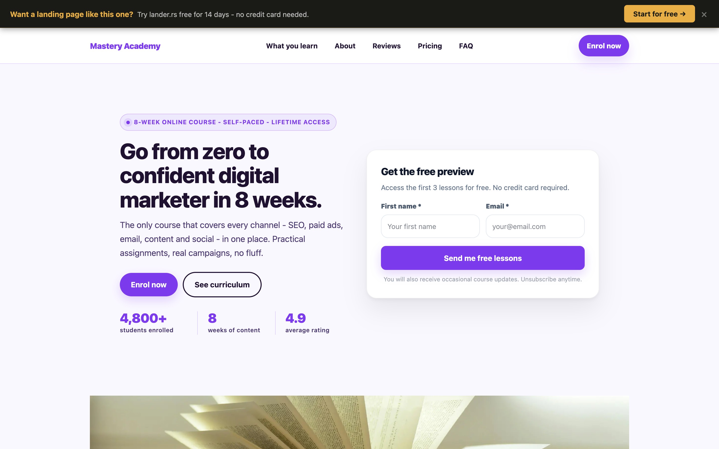
Desktop view — above the fold
Notice the choices made in the first screen:
- The headline leads with a result, not a course name. "Master Digital Marketing and Get Paid to Run Campaigns" tells the visitor where they'll end up. Contrast that with "Digital Marketing Mastery Course" which tells them nothing about their life after.
- The subheadline handles the objection immediately. "No experience required. No agency job needed." The two biggest fears of a beginner are dismissed before the visitor has scrolled at all.
- Social proof numbers are specific and above the fold. Student count, completion rate, and average outcome are visible before any scrolling. Vague claims ("thousands of happy students") do less than "847 students enrolled, 91% completed."
- One CTA, clearly labeled. "Enroll Now - $197" puts price and action in the same button. No surprises at checkout means fewer abandoned carts.
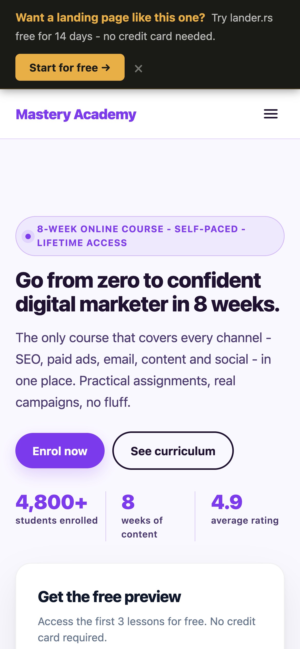
Mobile matters more than desktop
Most course purchases happen on phones. The headline, social proof bar, and enroll CTA are all visible on mobile before scrolling. The course curriculum appears below - readable without zooming, tappable without precision.
No navigation. No exits.
The page has no menu, no external links, and no platform branding. The only actions are enroll or leave. That constraint is the point.
Mobile view (390px)
What are the 5 elements a course landing page needs?
Every high-converting course page has these five sections, in roughly this order:
The outcome headline
One sentence describing where the student ends up. Not what they'll learn - where they'll be. "Land your first freelance client in 30 days" beats "Learn freelance marketing."
The transformation story
Two short paragraphs: where the student is now (the painful status quo) and where they will be after the course. Make the before and after concrete. Readers recognise themselves in the "before" and buy the "after."
Social proof with specific results
"This course changed my life" converts nobody. "I went from zero clients to $4,200/month in 6 weeks after finishing module 4" converts. Real names, real numbers, real timeframes.
A curriculum that builds desire
Don't list module names. List what the student will be able to do after each module. "Module 3: Facebook Ads" is a content description. "Module 3: Set up your first profitable ad campaign with a $10/day budget" is a promise.
One enrollment CTA, repeated
The enroll button should appear at least three times: above the fold, after testimonials, and at the bottom. Each instance can have a slightly different label: "Enroll Now," "Join 847 Students," "Start Today." Same destination, different framing.
How do you write a headline that sells a course?
The formula that works: [Specific result] in [Timeframe] - even if [Biggest objection].
Weak - describes the course
"Full-Stack Digital Marketing Mastery Course - 12 Modules, 40+ Hours"
Strong - describes the student's outcome
"Get Your First Paying Marketing Client in 30 Days - Even With Zero Experience"
The weak version tells the visitor what they're buying. The strong version tells them what their life will look like after. Buyers pay for the second one.
Match the headline to your traffic source
If someone clicked an Instagram reel titled "How I made $5k freelancing with no experience," your landing page headline should echo that hook. "How I Did It - And How You Can Too in 30 Days" continues the conversation they were already in. Dropping them on a generic course page breaks it.
What kind of social proof actually converts on course pages?
Course buyers have seen fake testimonials. They know stock photos. The bar for credibility is higher than it used to be. What converts now:
Results with a specific before/after and timeframe
The template: "Before the course I [specific painful situation]. [Time after starting], I [specific result]." Add a real name and ideally a job title or niche. The more specific, the more believable. Generic praise ("Great course, highly recommend!") does almost nothing.
Student count with a completion stat
"847 students enrolled" is good. "847 students enrolled, 91% completed the full course" is significantly stronger. Completion rates signal that the course delivers on its promises - students don't finish courses they aren't getting value from.
Instructor credibility framed as student benefit
Don't write your bio as a CV. Reframe every credential as proof that students will get results. Instead of "10 years in digital marketing," write "10 years running campaigns that generated over $2M in revenue for clients - the same strategies you'll learn here."
How should you present pricing on a course landing page?
Price anxiety is the final objection before purchase. These three things reduce it without discounting:
- Put the price in the CTA button. "Enroll Now - $197" eliminates checkout surprise. Visitors who click already know the price; their drop-off rate on the checkout page is significantly lower.
- Anchor it against the alternative cost. If your course teaches a skill that normally costs $3,000 to learn at a bootcamp, say so. "Get the same outcome for $197 instead of $3,000" makes the price feel like a bargain rather than an expense.
- Offer a guarantee. "30-day money-back guarantee, no questions asked" removes the risk from the decision entirely. If the course is good, you'll rarely see refund requests - and the guarantee will have paid for itself many times over in enrollments you would have lost without it.
The goal isn't to hide the price. It's to make the price feel like an obvious decision by the time the visitor sees it. Do that work earlier in the page.
See what your course page could look like
Describe your course in a prompt. lander.rs generates the full page - headline, curriculum, testimonials, pricing, CTA - in about 60 seconds. Free forever, no credit card.
How do you build a landing page for your online course?
Describe your course in a prompt
Register at lander.rs and type something like: "Digital marketing course for beginners. 12 modules, 40 hours. Teaches SEO, paid ads, and social. Target student: someone switching careers or starting freelance. $197 one-time." A full page is generated in about 60 seconds.
Replace generated copy with real proof
Swap in your actual student testimonials with specific results. Add your real completion rate and enrollment count. Put your real price in the CTA. The AI generates the structure; your real data makes it convert.
Point your traffic here, not at Teachable
Change your Instagram bio link, your ad destination URL, and your email CTA to point to the landing page. The Teachable or Gumroad page stays as your checkout - the landing page does the persuasion first.
Connect your own domain
Your page can live at course.yourdomain.com or any subdomain you own. A custom domain looks more professional than a platform URL and is one less reason for a visitor to hesitate.